Project |
|
Glass Doors |
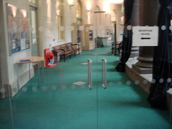
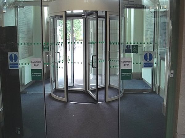
Poor Design - Before: With the internal glass doors - Visually Impaired people will find it difficult to see the details of the warning circles (strip) on the glass doors. This is because many Visually Impaired people have a loss of colour perception, which creates difficulty for them in detecting subtle variations in colour - details and textures merge together into an indefinable mass. Logically, the warning strips should be coloured to stand out from the background, not merge with it. This also applies to the principal entrance i.e. Revolving Door.
High Peak Access wrote to the University of Derby, re Buxton Campus raising their awareness to the inappropriate colour contrast of the warning circles for Visually Impaired People. The letter was promptly acknowledged, and modifications swiftly ensued.

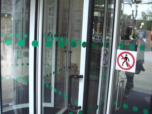
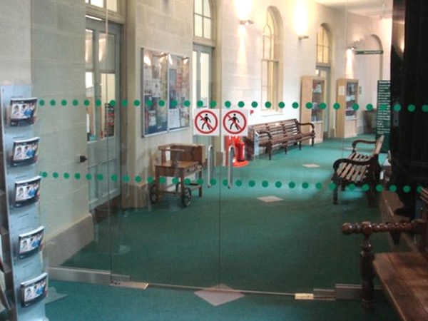
Good Practice After: The warning strips have been changed to green, a good tonal contrast, and warning pictorial notices have also been added to both the internal doors, and to the principal revolving entrance door. These manifestations are clearly visible, and are effective at achieving visual contrast when viewed against internal and external backgrounds. The location of the highly visible concise, pictorial signs on both the external and internal doors also communicates the message that this is Glass.
Good Practice working together to ensure equal access for ALL.


Category: |
Poor Practice |


